
The problems that I had to solve when redesigning the user interface of the strafe esports was the challenge of improving navigation and accessibility. One of the tasks was simplifying the navigation structure and ensuring that users could seamlessly access core features within the app such as teams, events, players, games and more. Another challenge I was tasked with was enhancing the match details display in which I designed a dedicated match detail screen that serves as a template amongst games. This included player statistics, game statistics, timelines of the game, player information, and game highlights. The third objective was to upgrade the notification system, in which the task was to fix existing issues with the notifications and enhance the user interface regarding those issues. The last objective was to optimize the visual hierarchy to improve the readability and usability of the interface by emphasizing elements such as matches, statistics, schedules, and other primary user actions.
This individual project was run across two semesters, where I was the sole developer and creator of the redesign of the strafe esports app. I was responsible for building out a proposal document that was supported by extensive research, data, and literature analysis in which objectives and goals were established before beginning the design portion of the project. I engaged in collaborative and creative conversations in which multiple people gave me the ability to spark different ideas in the design process. This led me to be able to compare user data and gather real-world insights by conducting early prototype testing to validate the efficiency, and the aesthetics, and the minimalist design of the prototype.
The objectives for this project began with creating a user-centered design approach to make improvements to the UI which involved:
#1: Improving Navigation and Accessibility:
Simplify the navigation structure to ensure seamless access to core features (teams, events, players, games). Create a central hub homepage with categorizing tabs, dropdown filters, or sidebars for easy content access.
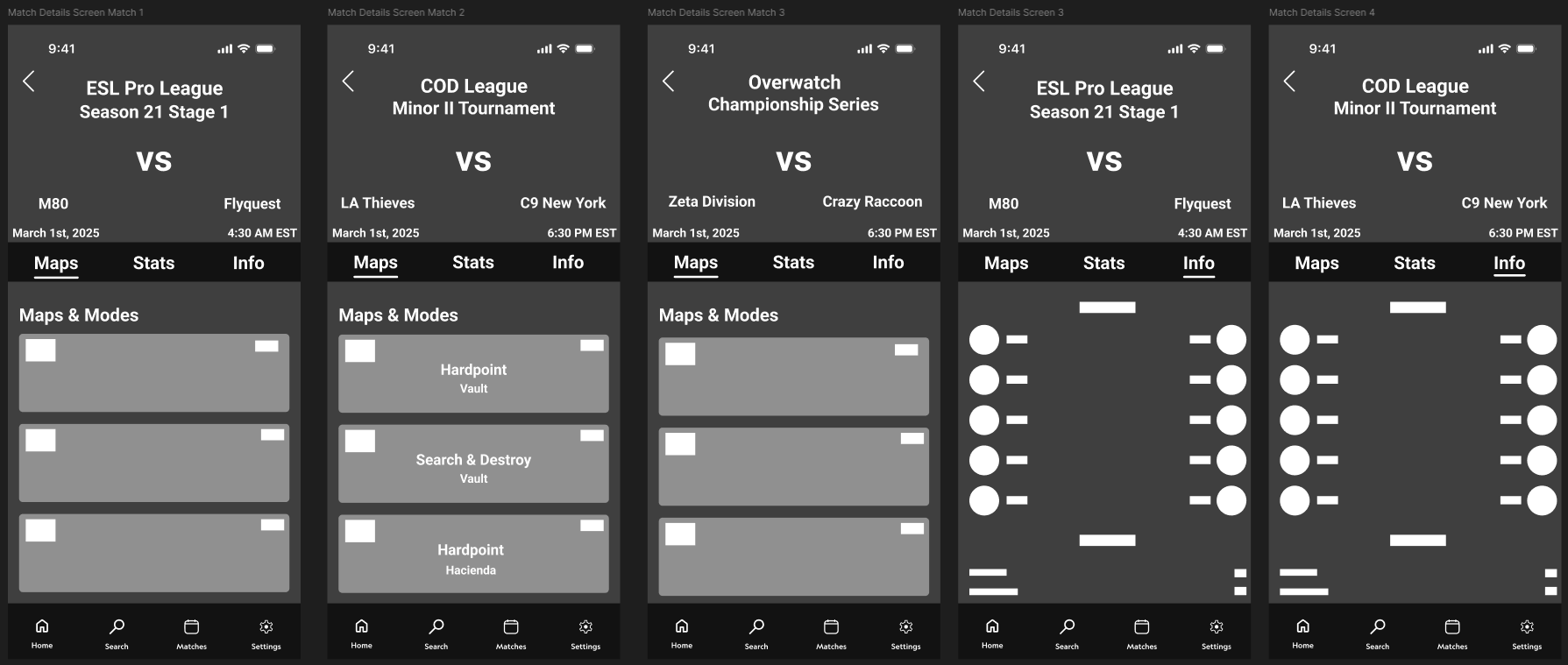
#2: Enhancing Match Details Display:
Design a dedicated match detail screen template with comprehensive information such as player/game statistics, game timelines, team information, and game highlights. Provide a cleaner and concise representation of match details for better user interaction.
#3: Upgrading Notification System:
Address and resolve issues related to unwanted notifications and lack of customizable notification options. Implement a notification settings page with toggles allowing users to customize and control the notifications they receive, particularly focusing on spoiler-free options.
#4: Optimizing Visual Hierarchy:
Improve readability and usability by clearly emphasizing primary actions and content such as matches, statistics, and schedules. Establish a consistent color palette, clear typography, and intuitive design patterns for simplified usage and enhanced clarity through color-coded elements.
I arrived at the solutions for the strafe esports redesign of the app through a high-fidelity prototype that will provide a user-centered design approach to making improvements to the interface. These improvements will include things such as creating sorting/filtering features, better search functionality, and esports match data layout design; this will redesign the app for better functionality and user engagement. Testing the usability will be a measurement of success for the outcome of the project. The research in this project was dependent on the quality of the research conducted during the literature and methodology reviews. In order to understand the users’ needs, research was done so that the redesign could be designed in an accurate manner.


The low-fidelity prototype for the Strafe Esports redesign focused on reworking the app’s navigation, match details, and notification systems. It introduced a simplified bottom navigation bar, dedicated screens for matches and statistics, and improved search functionality to support better filtering by games and events. These early wireframes helped establish a more intuitive flow that addressed key user frustrations around cluttered layouts, inefficient access to match data, and limited notification customization.


The high-fidelity prototype delivers a refined Strafe Esports experience focused on usability, clarity, and faster access to critical match information. Key improvements include a streamlined home page for live and upcoming matches, an enhanced search and filter system for games, regions, and events, detailed match statistics pages, and a customizable notification center featuring spoiler-free settings. The redesign applies strong visual hierarchy, intuitive navigation, and minimalist design principles to significantly improve task efficiency and user satisfaction.


